Guide to Choosing the Right Colour Scheme
- Radhika Maheshwari

- Jan 1, 2020
- 2 min read
Updated: Aug 5, 2023
Colours have the power to indirectly influence the soul. Picking up a good colour combination that is why has an importance of its own. It can be tricky, but with the right knowledge, everything is possible.
Let me get started with the basics.
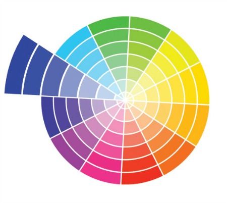
Below is a colour-wheel. A concept we all are well acquainted with, but very few know how to use it.

A colour-wheel is a tool that acts as a guide to combining colours. It determines the relationship between primary, secondary, tertiary colours.
FUN-FACT: The first colour-wheel was made by Sir Isaac Newton in 1666.
Before we begin discussing colour schemes, let us understand a few basic terms.
Tint – Colour lightened by adding white.
Hue – Pure colour, without mixing, as from a paint tube.
Tone – Colour lightened or darkened by adding grey.
Shade – Colour darkened by adding black.
While developing the best colour combination; consider tint, hue, tone and shade as it adds more power and improves our scope.
Let us begin talking about the basic colour-schemes.
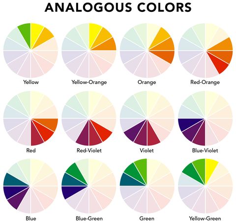
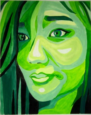
1. Analogous Colour Scheme – Three colours next to each other on the colour wheel.
2. Monochromatic Colour Scheme – Tints, tones and shades of the same Hue.
3. Triadic Colour Scheme – Three colours that are equally spaced on colour wheel.
4. Complementary Colour Scheme – Two colours that are opposite to each other on the colour wheel.
5. Square Colour Scheme – Choose four colours that form a square on the colour wheel.
6. Tetrad (Rectangular) Colour Scheme
7. Split Complementary Colour Scheme
Points to remember while choosing the Right Colour Scheme :
1. Mood
Whether it an artwork, or the walls of your room, determine the mood you want to create using the colours. For a romantic vibe, go for softer colours. Use bold colours to attract and create emphasis.
2. Purpose
Understand why you are doing it; is your artwork to be put in a corporate space or on a bedroom wall? Study the colours of the walls and surroundings. Think about the people living in that area. Think about why your artwork should be put there.
3. Balance
Don’t go for all bold or all soft, try to achieve a balance. What this means is that it should be easy on the eye. Understand the intensity of colours. Apply a black and white filter to your chosen colour scheme to study the depth and effect of the colour composition. The goal should be to make it as pleasing to the eye as possible.
4. Theme
If you are working on a particular theme, use colours relating to it. Don’t use all the colours available, unless you want to go all funky. For a more subtle finish, pick 2-5 colours, and play with their tints, tones and shades. Think about the overall effect and the vibe you want to create around your art.
Colours have the potential to give rise to sensations and leave a lasting effect. Pick your colours wisely. Experiment and innovate.
What was the recent colour scheme that you tried? Tell me in the comments section.
And, #stayrad !!


Comments